I’ve noticed that with software there sometimes exists a bit of an ironic relationship where the product with the most features somehow is also able to be the most minimal. Emacs is one such example, as it’s a text editor that can be configured to perform tasks you’d never think a text editor would be able to - and it does this with almost no UI whatsoever. It’s fair to say I’m a big fan of reducing visual clutter on my devices. For example, my laptop runs Linux with no Desktop environment, and my phone home screen is basically just a calendar widget. Neither device is minimal in the sense of having little functionality, but both are definitely minimal in the sense of keeping the interface to a minimum.
Today I want to talk about another piece of software that I use that can be said to enable this form of minimalism. It is of course the Norwegian-made browser Vivaldi. Vivaldi is the brain-child of Jon von Tzetchner, former CEO of Opera, and is essentially aiming to be the go-to browser for power-users. In my opinion it is doing quite well in catering to this audience, as the browser is known for its massive array of features and extensive customizability.
Some of the stand-out features of Vivaldi include:
- Made by a trustworthy company with no interest in tracking users (although not FOSS)
- A highly customizable UI
- A built in E-mail, calendar, to-do list and RSS feed reader client
- Page Tiling - basically showing more than one tab in the same window, for example side by side
- Web Panels - essentially a set of bookmarked pages that can be viewed without switching the tab
- Work spaces, which allow you to have tabs in separate windows within the same window.
- Translator, Contact list, Reading list, Note taking client, and sooo much more.
Who on earth needs all of that? Well, the beauty of it all is that Vivaldi does not force you to use any of these, you can turn all of these things off if you wish. You’re not even locked in once you chose to use one of these features, as Vivaldi allows you to export your data - you are in full control. For example, I was using the built-in note-taking client for a while, but then opted for something else. Switching was no problem, because Vivaldi lets you export all your notes to Markdown.
Now because Vivaldi is such a beast, it can seem a little intimidating when you fire it up for the first time. So today I want to highlight the specific features of Vivaldi that allow you to go from this:
To this:
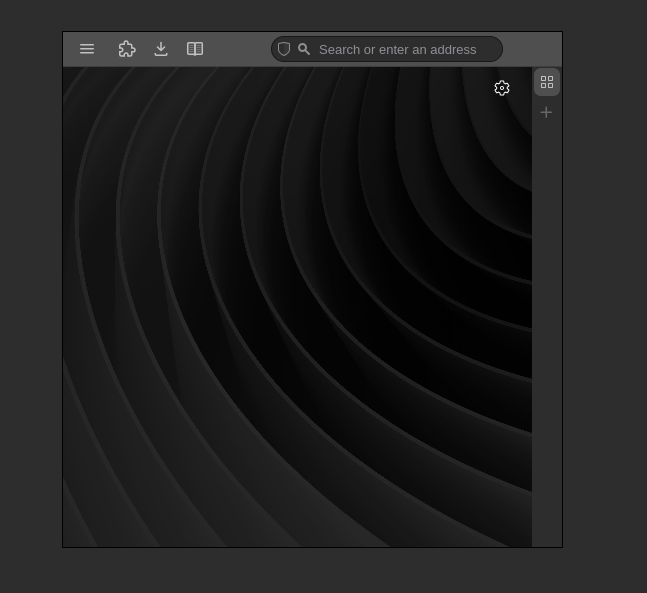
You’re probably looking at my screen-shot and thinking “How do you do … anything?”. The short answer is: Keyboard shortcuts! Vivaldi allows you to map whatever button combination you want to what must be hundreds of different commands. Closing a tab Ctrl + W, going to the previous page Alt + LeftArrow, opening E-Mail Ctrl + Shift + M, etc. That alone has allowed me to remove most of the UI.
However, there are some exceptions to what can be removed. One example is the address field, which has to be in the address bar to work properly. You could hide the address bar in which case pressing Ctrl + L would actually pop out a little field to type in, but hiding the address bar is a little annoying if you use any of the UI in the Mail client, since it no longer will be accessible. Sure, you could bind a key to toggle the address bar for when you need it. However, I find that more cumbersome than just living with the address bar. This is because if you hide the address bar, Vivaldi will replace it with a minimal window title bar, which renders the net space savings of hiding the address bar minimal.
Next, you might have thought that I don’t have tabs. This is not quite correct, as I have a very small vertical tab bar at the right edge of the window. It’s set to the minimum width such that you can only see the favicons of websites, not their titles. I tried going completely without a tab bar, but found the lack of visual feedback a bit jarring.
You might think that seeing the website titles is quite important, since it might be hard to tell apart two tabs that are on the same domain otherwise. Luckily, you can enable list view for the tab switcher, meaning if I hit Ctrl + Tab I can cycle through the tabs in a little pop up that shows the tab titles. This is such an underrated feature as it makes switching tabs with your keyboard super efficient.
The only things left as UI are for essential functions that do not have a internal page that can be mapped to a keyboard shortcut but do provide a button for a pop-out menu. This includes the extensions, reading list and downloads popups. On the far left is the burger menu to access settings, which cannot be removed. I also hide Speed Dials and everything else on the start page. That’s it!
UI clutter, Check; Tab clutter, Check. What’s left? Well, as I alluded to in the introductory paragraph I don’t really wish to compromise on functionality. Unfortunately, if you use web panels, Vivaldi currently requires you to have the panel bar showing, even if the panel buttons are not on the panel bar! If you don’t show the panel bar, the sites you have as panels will unload, meaning you will have to load them from scratch every time you want to use them. You could insert your own CSS modifications (which Vivaldi allows), but I have personally not gotten my CSS code to reliably hide/unhide the panel bar on hover. This annoyance had lead me to realize that I can achieve virtually the same functionality without actually using panels.
How, you ask? My work-around has been a mix of tab tiling and workspaces with pinned tabs. It’s not quite as flexible as actual panels, but it fully satisfies my needs. If I need to quickly view a site that would be panel-worthy, I just hit my keybinding to switch workspaces until I get to the one with the page I’m looking for. If I need to split view that page for multi-tasking, I simply tile the tab inside that workspace.
In some ways this approach off weaning yourself off of panels (especially the built-in ones) is actually superior, because the panel implementations of many features of Vivaldi are less feature-rich than their internal page equivalent. Compare for example the calendar panel to the calendar page, and you’ll see what I mean. That being said, how nice is it that Vivaldi gives you both, a panel implementation of something, and a internal page or pop-out version?
And that’s basically the essence of my setup! If you are not (yet) a Vivaldi user, this was probably too much information for you… hopefully I managed to get you curious about Vivaldi though. If you are a Vivaldi user, I hope you found my approach inspiring for your own configuration! If you liked the theme I use, I actually published it here, enjoy :)
P.S.: Legend has it you’ll never be able to look at a MacBook with MS Word open in Google Chrome the same way once you have seen the light…
Back to top